

How To Make Responsive Table?
Everyone uses tables in their sites, but the tables look very bad on mobile devices. Even if you set the width of the table to 100%, it will be reduced to a certain extent and the texts will be very small. It is not useful at all. In this article I will show you the responsive table.
HTML Codes
Simple sample table codes.
<table>
   <thead>
     <tr>
       <th>First Name</th>
       <th>Last Name</th>
       <th>Job Title</th>
     </tr>
   </thead>
   <tbody>
     <tr>
       <td>James</td>
       <td>Matman</td>
       <td>Chief Sandwich Eater</td>
     </tr>
     <tr>
       <td>The</td>
       <td>Tick</td>
       <td>Crimefighter Sorta</td>
     </tr>
   </tbody>
</table>
Css Codes
General css codes for tables. You can customize the style yourself.
/*
General Table Styles
*/
table {
  width: 100%;
  border-collapse: collapse;
}
tr:nth-of-type(odd) {
  background: #eee;
}
th {
  background: #333;
  color: white;
  font-weight: bold;
}
td, th {
  padding: 6px;
  border: 1px solid #ccc;
  text-align: left;
}
Css Codes For Responsive Design
With these CSS codes and the @media query, your table will become responsive. What you need to be aware of here is the css codes with the comment “Table Headers” at the end. These css codes add columns before each <td> element. You need to customize this for each table.
/*
With this media query we make my table responsive under 760px width.
At the same time, it will also work in 768px and 1024px resolutions,
improving the look on devices such as iPads.
*/
@media
only screen and (max-width: 760px),
(min-device-width: 768px) and (max-device-width: 1024px)  {

    /* Force table to not be like tables anymore */
    table, thead, tbody, th, td, tr {
        display: block;
    }

    /* Hide column headers (but not display: none;) */
    thead tr {
        position: absolute;
        top: -9999px;
        left: -9999px;
    }

    tr { border: 1px solid #ccc; }

    td {
        / * Make it behave like a line * /
        border: none;
        border-bottom: 1px solid #eee;
        position: relative;
        padding-left: 50%;
    }

    td:before {
        / * Edit column as if header exists * /
        position: absolute;
        /* Make room for the title on the left */
        top: 6px;
        left: 6px;
        width: 45%;
        padding-right: 10px;
        white-space: nowrap;
    }

    /*
    Table Headers
    Add column headers for each <td> element
    You need to customize each table.
    */
    td:nth-of-type(1):before { content: "First Name"; }
    td:nth-of-type(2):before { content: "Last Name"; }
    td:nth-of-type(3):before { content: "Job Title"; }
    td:nth-of-type(4):before { content: "Favorite Color"; }
    td:nth-of-type(5):before { content: "Wars of Trek?"; }
    td:nth-of-type(6):before { content: "Porn Name"; }
    td:nth-of-type(7):before { content: "Date of Birth"; }
    td:nth-of-type(8):before { content: "Dream Vacation City"; }
    td:nth-of-type(9):before { content: "GPA"; }
    td:nth-of-type(10):before { content: "Arbitrary Data"; }
}
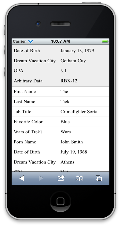
Result
It will look like this under 760px width;


