Posts

How To Make Responsive Table?

Everyone uses tables in their sites, but the tables look very bad on mobile devices. Even if you set the width of the table to 100%, it will be reduced to a certain extent and the texts will be very small. It is not useful at all. In this article I will show you the responsive table.

HTML Codes

Simple sample table codes.

<table>
   <thead>
     <tr>
       <th>First Name</th>
       <th>Last Name</th>
       <th>Job Title</th>
     </tr>
   </thead>
   <tbody>
     <tr>
       <td>James</td>
       <td>Matman</td>
       <td>Chief Sandwich Eater</td>
     </tr>
     <tr>
       <td>The</td>
       <td>Tick</td>
       <td>Crimefighter Sorta</td>
     </tr>
   </tbody>
</table>

Css Codes

General css codes for tables. You can customize the style yourself.

/* 
General Table Styles
*/
table { 
  width: 100%; 
  border-collapse: collapse; 
}
tr:nth-of-type(odd) { 
  background: #eee; 
}
th { 
  background: #333; 
  color: white; 
  font-weight: bold; 
}
td, th { 
  padding: 6px; 
  border: 1px solid #ccc; 
  text-align: left; 
}

Css Codes For Responsive Design

With these CSS codes and the @media query, your table will become responsive. What you need to be aware of here is the css codes with the comment “Table Headers” at the end. These css codes add columns before each <td> element. You need to customize this for each table.

/* 
With this media query we make my table responsive under 760px width. 
At the same time, it will also work in 768px and 1024px resolutions, 
improving the look on devices such as iPads.
*/
@media 
only screen and (max-width: 760px),
(min-device-width: 768px) and (max-device-width: 1024px)  {

    /* Force table to not be like tables anymore */
    table, thead, tbody, th, td, tr { 
        display: block; 
    }
    
    /* Hide column headers (but not display: none;) */
    thead tr { 
        position: absolute;
        top: -9999px;
        left: -9999px;
    }
    
    tr { border: 1px solid #ccc; }
    
    td { 
        / * Make it behave like a line * /
        border: none;
        border-bottom: 1px solid #eee; 
        position: relative;
        padding-left: 50%; 
    }
    
    td:before { 
        / * Edit column as if header exists * /
        position: absolute;
        /* Make room for the title on the left */
        top: 6px;
        left: 6px;
        width: 45%; 
        padding-right: 10px; 
        white-space: nowrap;
    }
    
    /*
    Table Headers
    Add column headers for each <td> element
    You need to customize each table.
    */
    td:nth-of-type(1):before { content: "First Name"; }
    td:nth-of-type(2):before { content: "Last Name"; }
    td:nth-of-type(3):before { content: "Job Title"; }
    td:nth-of-type(4):before { content: "Favorite Color"; }
    td:nth-of-type(5):before { content: "Wars of Trek?"; }
    td:nth-of-type(6):before { content: "Porn Name"; }
    td:nth-of-type(7):before { content: "Date of Birth"; }
    td:nth-of-type(8):before { content: "Dream Vacation City"; }
    td:nth-of-type(9):before { content: "GPA"; }
    td:nth-of-type(10):before { content: "Arbitrary Data"; }
}

Result

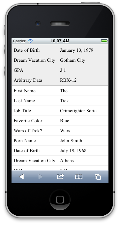
It will look like this under 760px width;
Responsive Tablo Yapımı

Herkes sitelerinde tablo kullanır fakat tablolar mobil cihazlarda çok kötü gözükmektedir. Tablonun genişliğini 100% olarak ayarlasanız bile belli bir yere kadar küçülecek ve yazılar çok ufak olacaktır. Hiç kullanışlı değildir. Bu yazımda size responsive tablo yapımını göstereceğim.

Html Kodları

Basit bir örnek tablo kodları.

<table>
   <thead>
     <tr>
       <th>First Name</th>
       <th>Last Name</th>
       <th>Job Title</th>
     </tr>
   </thead>
   <tbody>
     <tr>
       <td>James</td>
       <td>Matman</td>
       <td>Chief Sandwich Eater</td>
     </tr>
     <tr>
       <td>The</td>
       <td>Tick</td>
       <td>Crimefighter Sorta</td>
     </tr>
   </tbody>
</table>

Css Kodları

Tablolar için genel amaçlı oluşturduğumuz css kodları. Stili kendiniz özelleştirebilirsiniz.

/* 
Genel Stiller
*/
table { 
  width: 100%; 
  border-collapse: collapse; 
}
/* Zebra Çizgileri Stili */
tr:nth-of-type(odd) { 
  background: #eee; 
}
th { 
  background: #333; 
  color: white; 
  font-weight: bold; 
}
td, th { 
  padding: 6px; 
  border: 1px solid #ccc; 
  text-align: left; 
}

Responsive Css Kodları

Bu css kodları ve @media sorgusu ile tablomuz responsive hale gelecektir. Burada dikkat etmeniz gereken şey, en sonda “Tablo Başlıkları” yorumuna sahip css kodlarıdır. Bu css kodları sütun başlıklarını her <td> elementinin yazısının öncesine ekleme yapar. Bunu her tablo için özelleştirmeniz gerekmektedir.

/* 
Bu media query ile 760px genişlik altında tablomuzu responsive yaparız.
Aynı zamanda 768px ve 1024px çözünürlüğü arasında da çalışmasını sağlayarak,
Ipad gibi cihazlarda da görünümünü iyileştirmiş oluruz.
*/
@media 
only screen and (max-width: 760px),
(min-device-width: 768px) and (max-device-width: 1024px)  {

    /* Force table to not be like tables anymore */
    table, thead, tbody, th, td, tr { 
        display: block; 
    }
    
    /* Sütun başlıklarını gizle (display: none; ile değil ama) */
    thead tr { 
        position: absolute;
        top: -9999px;
        left: -9999px;
    }
    
    tr { border: 1px solid #ccc; }
    
    td { 
        /* Satır gibi davranmasını sağla */
        border: none;
        border-bottom: 1px solid #eee; 
        position: relative;
        padding-left: 50%; 
    }
    
    td:before { 
        /* Sütun başlığı varmış gibi düzenle */
        position: absolute;
        /* Sol tarafında başlık için yer aç */
        top: 6px;
        left: 6px;
        width: 45%; 
        padding-right: 10px; 
        white-space: nowrap;
    }
    
    /*
    Tablo Başlıkları
    Her bir <td> elementi için sütun başlıklarını ekle
    Her tablo için özelleştirmelisiniz.
    */
    td:nth-of-type(1):before { content: "First Name"; }
    td:nth-of-type(2):before { content: "Last Name"; }
    td:nth-of-type(3):before { content: "Job Title"; }
    td:nth-of-type(4):before { content: "Favorite Color"; }
    td:nth-of-type(5):before { content: "Wars of Trek?"; }
    td:nth-of-type(6):before { content: "Porn Name"; }
    td:nth-of-type(7):before { content: "Date of Birth"; }
    td:nth-of-type(8):before { content: "Dream Vacation City"; }
    td:nth-of-type(9):before { content: "GPA"; }
    td:nth-of-type(10):before { content: "Arbitrary Data"; }
}

Sonuç

760px genişlik altında tablomuz bu şekilde gözükecektir.

mobile-table